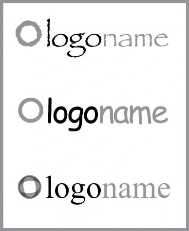
Fonts. There a literally thousands and thousands of them in use in the world today. So for a graphic designer, the choice in a logo design is crucial, they set the tone, the feel and the look of a logo design.
They can make the difference between a great looking logo, and a terrible one. Below are examples of how fonts effect the design, I have used a simple circle to represent the icon part of a logo, and I have only used 2 colors.
Lets start with the bad. These are fonts a designer should never use, even if the client requests them specially, the top 3 most hated (and rightly so) fonts for graphic designers:

1: Papyrus.
My personal most hated font. Its the go to font for book covers, and powerpoint presentations. Its just an ugly font, and can you believe it was used for the Avatar movie poster?!
2: Comic Sans.
The go to font if you want to make a cute, kiddy logo, used in schools…A LOT. There are other fonts out there that can do the same thing, just less, over used.
3. Times New Roman.
Maybe the most over used font ever. Used in books, book covers and the go to font to make things look “classy” or elegant.
Now I have gotten those out of the way, lets get to how fonts can make a difference to your logo.

1: Quicksand
I really like this thin, minimalist style. It makes for a very modern logo design, perfect for a photographer, graphic designer, or web developer logo.

2: Caesar Regular
A nice, clean, yet elegant looking font. This would be suitable for the logo design of a law firm, accountant, psychologist, etc.
 3: Airstrike Regular
This a bold, striking font. Slightly futeristic looking. This would be the ideal look for a crossfit, gym, racing, sports logo.

4: Din
for this example I have used a mix of Din Light and Din bold. This splits the name a little bit more than just using color. Again, this could be used for any professional company.
So there we have 4 examples of many different ways fonts can be used in a logo design. A point I should make is, there are thousands of fonts, so when you see your 1st set of logo ideas from you designer, take into consideration, they have probably picked each font for a particular reason.
Please share if you found this interesting or helpful.
