Most of you only see the final product, the final logo design, but what goes on behind the scenes?
Lets take this logo:

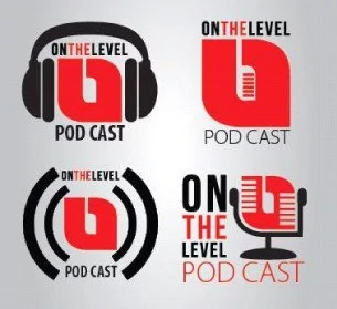
This is the final logo for a podcast. The brief was basically to use the red and grey colors, and to represent the modern format of a podcast. (one request was to include a nerdy design) The client showed us this previous design along with their comments:

“We currently have these 4 options that were presented to us. The parent company’s (On the Level Digital) logo is the red D I am just not feeling these 4 choices. While the incorporation of the microphone is a nice touch, it doesn’t really sum up that this is a modern/new media format….a podcast”
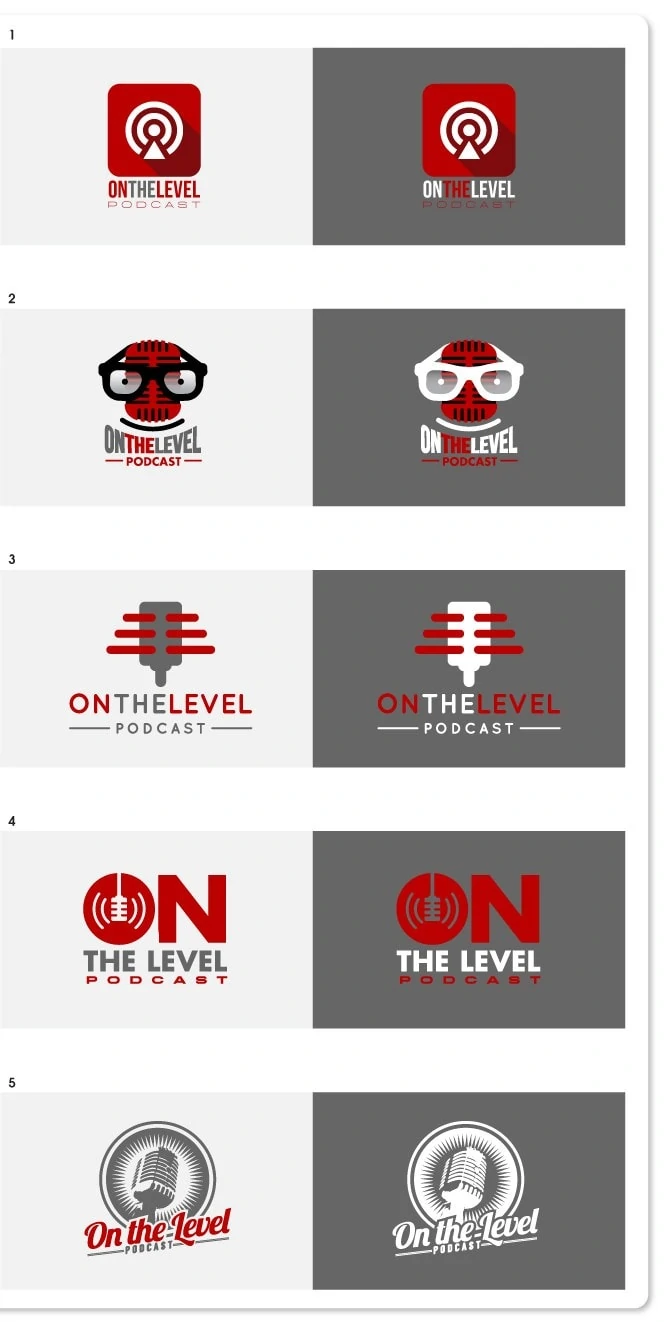
So with this brief, we set out to design the usual 5 initial designs (that is what we include in our logo design pack, other companies may design more, or less) We wanted to express something modern, eye catching and that will stand out from other podcast covers/logos. Here are the 1st set of designs:

1: This idea was just to modernize the existing podcast logo, a nice, simple, flat icon design. Very minimal and modern.
2: This was the Nerdy idea. Nerdy glasses around a microphone design, making a face.
3: Another simple, flat icon design, this time using the microphone, the lines cutting in represent the levels and the name underneath to be “on the level” as per the clients logo title.
4: This was meant to have a little more impact, again using a simple microphone and broadcast signal icon design.
5: This was actually my favorite. A modern, yet vintage feel using an old vintage microphone and a nice starburst behind it, keeping it simple by using only the 2 colors.
These ideas where submitted, and the clients feedback was as followed:
“Great work as always!
I love the idea of using 2 or 5 for a t-shirt or other hand outs at our live events, but for now my selection is 4
–use the design of the word “podcast” from #3 on #4 including the horizontal lines
–I am not sure the best way to add depth to something, but I was thinking maybe a shadow for the words “on the level” if you think there’s a better way or another option, please go with your best judgement maybe even a cord ‘plugging’ the work “on” into the words” the level”
We went away and worked on version 2, and ultimately the final version of the design you saw above.
This is basically how we work, this was a relatively quick turn around, sometimes this can reach version 5 and more. Each graphic designer works differently of course, this is just an example of how we work.
So, if you are looking for an awesome logo design, get in touch.

I love how vast the different designs were yet they all shared similar features. I’m sure it gave your client a wide spectrum to choose from and narrow down.
See the logo in action here: https://www.facebook.com/onthelevelpod