So, what got me thinking about this was the recent Instagram logo redesign. Its getting a lot of attention, for all the wrong reasons.
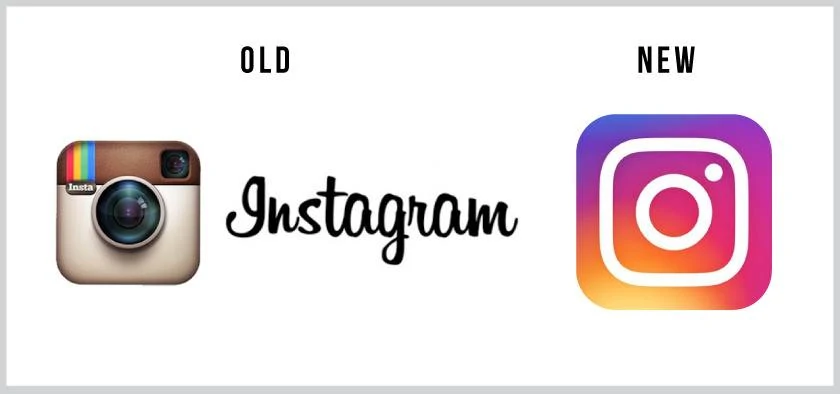 It’s getting a lot of hate, and I can understand why, it kind of looks like it has been redesigned by a child with no design skills. But I have to be honest, I like it. As any graphic designer knows, there is a lot more that goes on behind the scenes of a logo design, and I guarantee, in less than a couple of months, you will have forgotten about the old logo.
So that brings me on to my list of (personal) best and worst logo redesigns of recent times. Lets start with the best first.
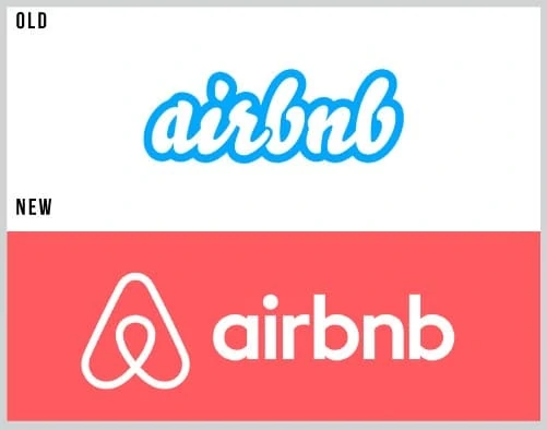 1: Airbnb
I really like this as a logo redesign. The old logo was getting old, the trending of recent logo’s has been the flat look, I think they nailed this. For me the “A” symbol kind of looks like a paper airplane, giving the “air” feel to the logo.
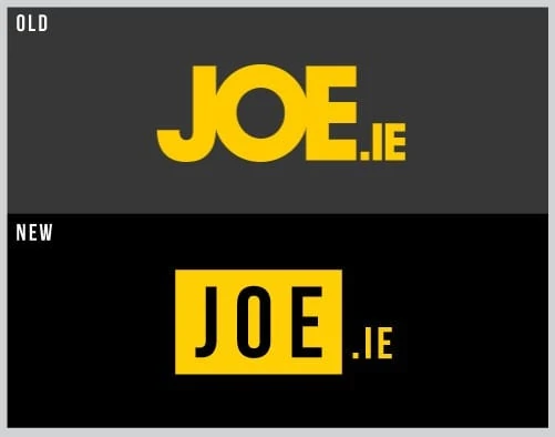
2: JOE.IE
This is cheeky entry really, as I was the one to redesign joe.ie’s old logo. This is to give you an idea of what goes into a redesign, you might look at this and say its a really simple design, and it is, but we went through around 10 different designs until the client was happy.
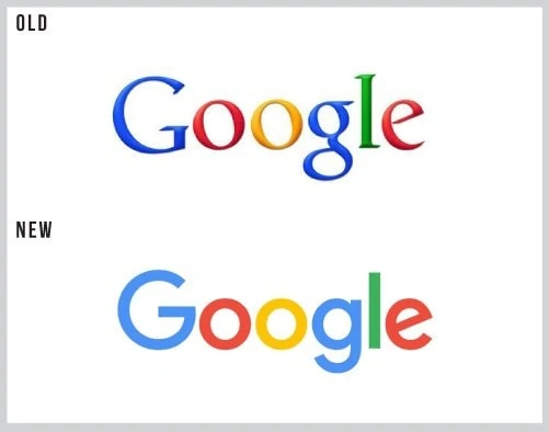 3: Google
I know, this got a lot of hate when it was 1st unveiled. But you have to admit, you probably have forgotten the old logo. It was only a matter of time before it was updated, the serif font was old school. And yes, it might be just a case of a font change, but its a good font change.
Now onto the worst logo redesigns.
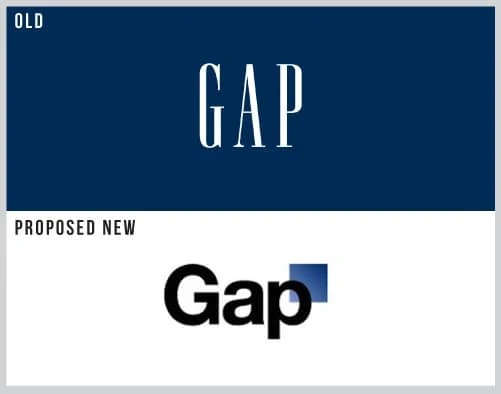 1: GAP
Ok, this didn’t happen, but it very nearly did. This was the proposed logo redesign that went out for market research. What where they thinking? the black P over a gradient looks terrible. But anyway, they have kept their old logo, which, well, works.
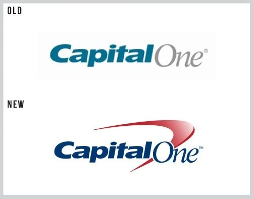
2: Capital One
I don’t understand why they would change that old logo? Its nice and simple, nice use of fonts and colors. They new logo has gone back in time, the swish and gradient combo is really old fashioned.
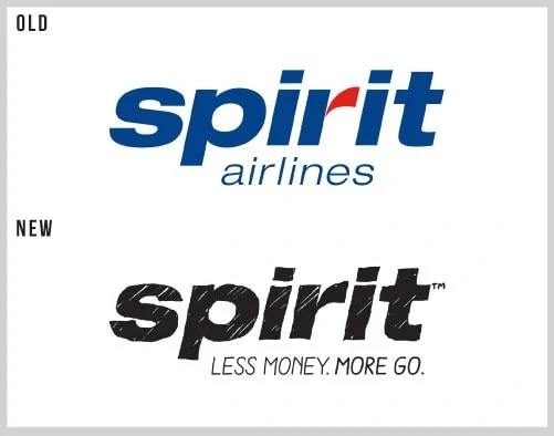 3: Spirit Airlines
Where to begin. The old logo was an airline logo, plain (ignore the pun) and simple. The new logo looks like a 4 year old has sketched it, which in my view does not emote trust about the plane you are about to get on, sketchy.
So there you have it, my personal best and worst logo redesigns. I would love to hear your thoughts on this, and let me know of your personal best and worst logo designs. More info on our graphic design services
